I’m not a designer, but I spent a good chunk of this week picking a visual system for AgentCrew Academy.
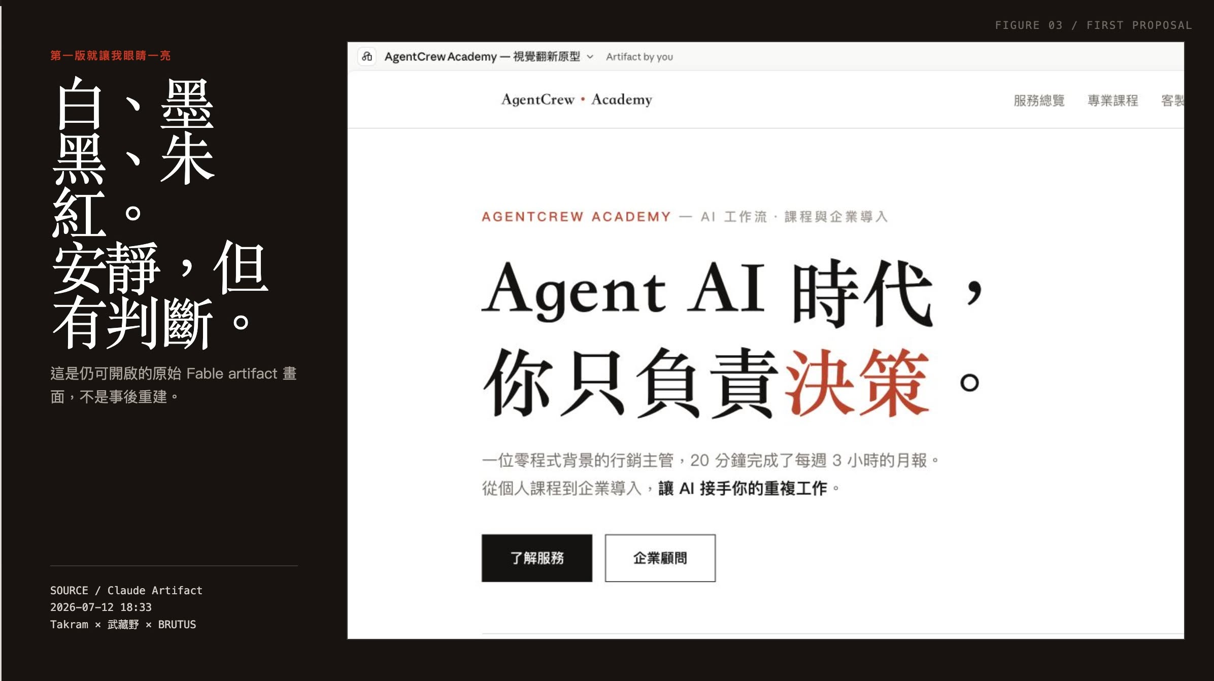
I started by having Fable draft a proposal, and the first version already caught my eye: white, ink, vermilion, black. Quiet, but decisive. This is a screenshot of the original Fable artifact, still openable, not something reconstructed after the fact.
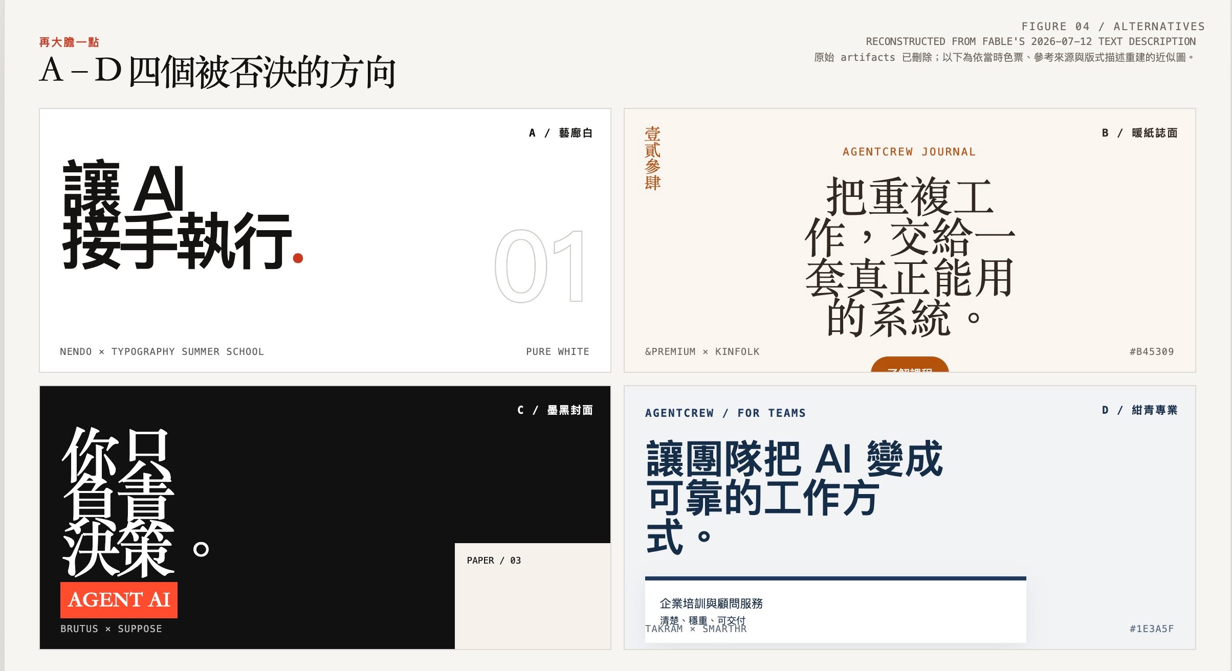
One version wasn’t enough, so I asked it to go bolder. That produced four rejected directions, A through D: gallery white, warm-paper editorial, ink-black cover, navy professional. Each one pulled from a different reference. NENDO’s typography summer school. The warm-paper editorial feel of &PREMIUM and Kinfolk. The ink-black covers of BRUTUS and SUPPOSE. The navy professionalism of Takram and SmartHR.
Later I tried a completely different approach, skipping Fable this time and asking GPT-image-2 directly for 5-10 style variations to choose from. Then I fed my pick back to GPT-5.6-sol and asked it to mock up a YouTube thumbnail. I also gave it my current YouTube channel homepage and had it build an HTML prototype of what the redesigned channel would look like. Once I settled on one, it built me a thumbnail template so I could swap in new content and titles going forward. I haven’t actually switched the channel art yet. I want to run an A/B test for a while first.
Working with GPT this time around felt just as good, so I think either path works. In the AI era, producing a prototype barely costs any time anymore. The hard part has shifted back to your own taste and judgment.
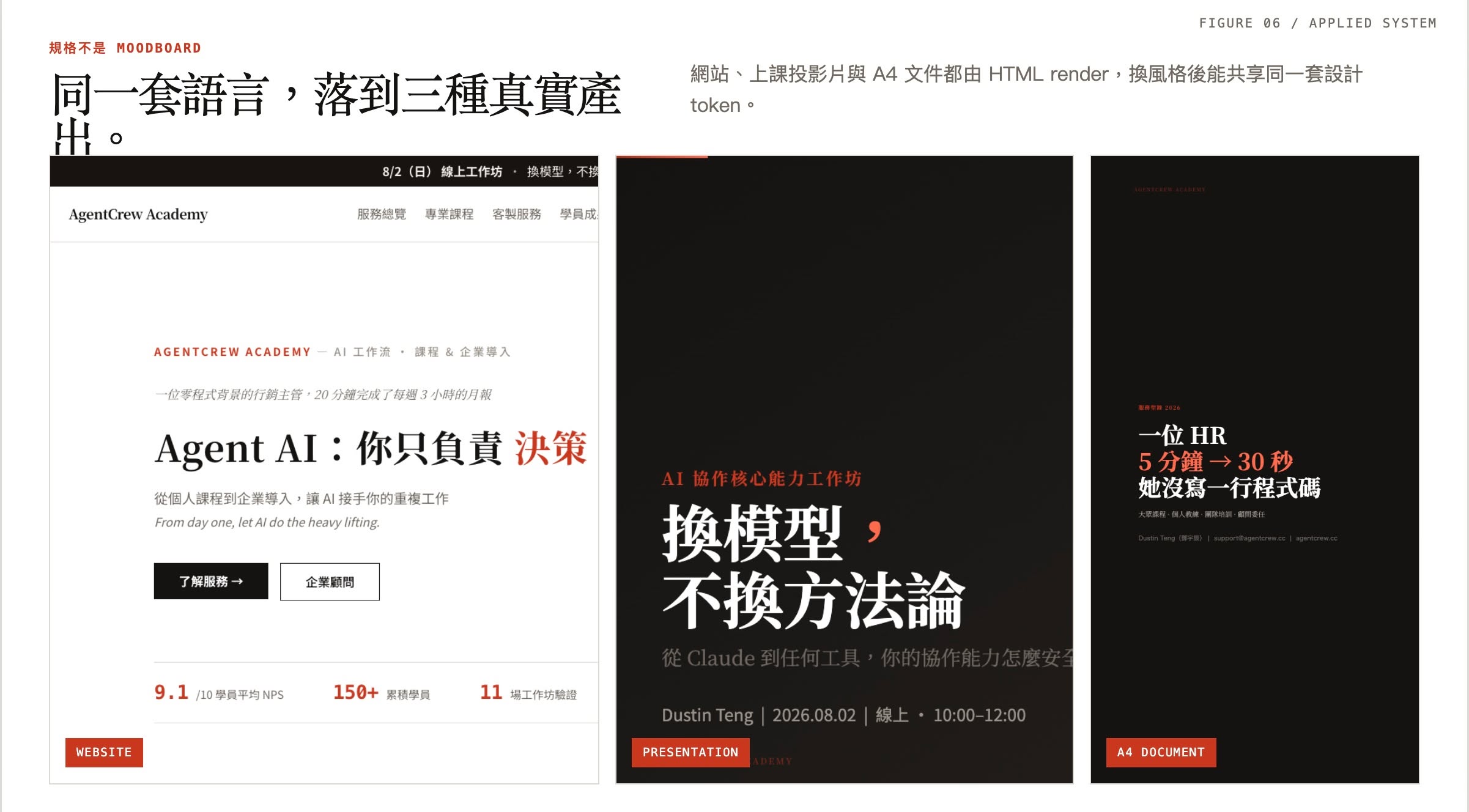
What I finally settled on wasn’t a moodboard. It was one visual language rendered into three real outputs: the website, the workshop slides, and the A4 documents are all HTML-rendered, so changing the style still shares the same set of design tokens.
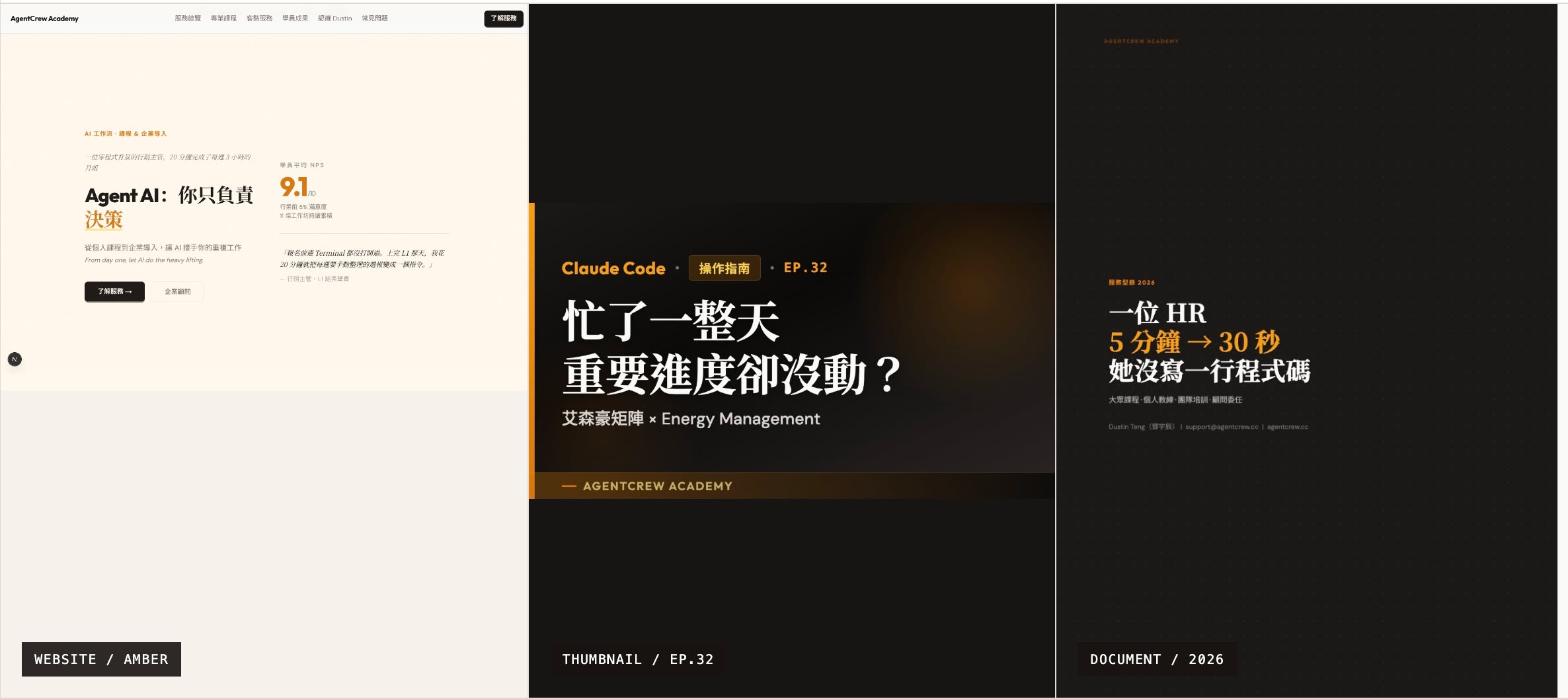
Along the way I also tested an amber variant, comparing it across the website, a YouTube EP.32 thumbnail, and the HR case-study document.
I’m planning to package this whole “picking brand visuals as a non-designer” process into a skill and release it later.